

Financial Relativity: Relative Return Charts
In our earlier piece on the "The Market Schwerpunkt: Gold vs. Bonds" I discussed the use of relative value charts to analyze markets and guide positioning. Here we expand the roster.

One of the increasingly difficult aspects of global investing has been the extent of market intervention in this unanchored fiat currency world. This is a fact of life, to which we must adjust our toolset, the better to understand what is happening.
Financial Relativity for Investors
The first thing novice investors observe is that financial markets are subject to periods of relative calm interrupted by wild volatility. Instinctively, one is led to seek the safety of cash, in the belief that this will prevent further losses. While having cash at hand is always great in a market crisis, the problem of raising cash in a falling market, soon creates a dynamic that is hard to manage. When do I sell? When do I buy?
The problem of moving back and forward to cash is one of market timing.
Invariably, any change to your investment portfolio involves timing. You must sell one asset to buy another. However, the difficulty with cash is that, in the short run, it has a fixed value. Cash deposits cannot go down, unless your bank fails. This is great, but it obscures the longer-term issue, which is the purchasing power of cash.
When managing a portfolio, we always need to mindful that the objective is balance between the preservation and the growth of purchasing power.
Wild swings between growth assets and cash can be counterproductive. There are always two decisions involved: the move into cash, and the later move out.
The dirty little secret of investor psychology is that we are all herd animals.
What we tend to learn, over time, is that the urge to raise cash is strongest when the markets are falling rapidly, and so our personal timing decision is herd timing.
There is always timing involved in any buy or sell decision. What causes problems is when we abandon control of when we choose to move to the crowd at large.
This creates a problem of selling lows to buy later highs.
The dynamic occurs because it feels safe to dash for cash in a market rout, and we feel safe to step back in when markets have recovered. It is hard to resist this urge, and so my approach is different. When holding non-cash assets, whose values move around every single day, I look instead at the relative purchasing power of assets.
When you travel abroad it is natural to watch currency exchange rates.
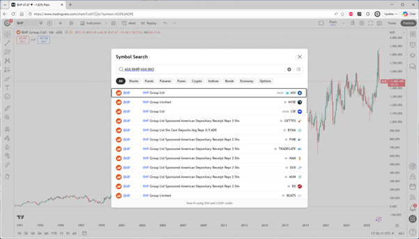
Think of shares in miner BHP Group XASX: BHP as a form of currency, that earns income through dividends, and can be exchanged, on a daily basis, for another currency, like miner RIO Tinto XASX: RIO. They have an exchange rate.
Let us explore this idea with some relative value charts.
I use Trading View for most market watching purposes.
Let me start by drawing attention to the percentage chart format.
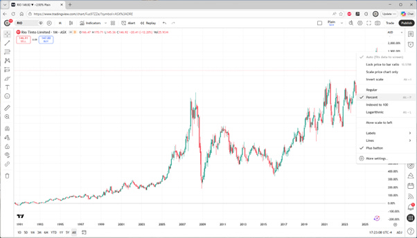
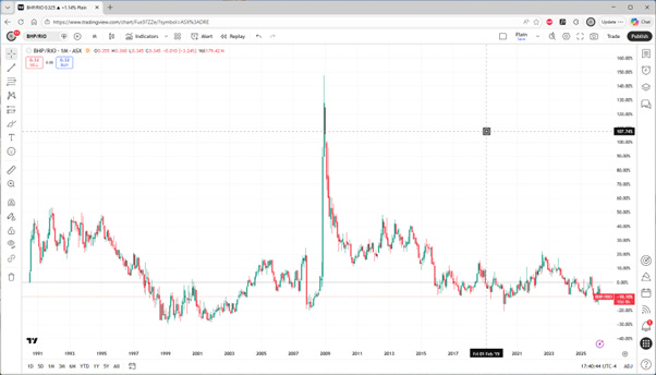
In the above chart of RIO, since 1991, I have used the pop-up menu on the vertical scale axis to change from the price, in AUD, to the percent change over time.
The cumulative price return of RIO over that period was 1,662.41%.
However, the stock pays dividends.
Adjusting the chart format for this is possible by choosing “Adjust for Dividends”.
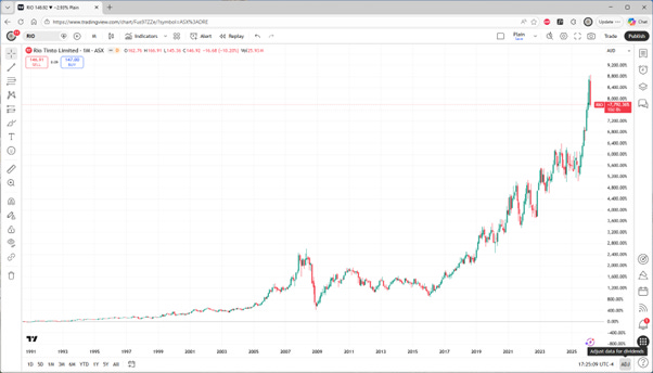
The cumulative total return of RIO over that period was 7,792.36%.
Notice the big difference when dividends are reinvested. This can often be done on an automatic basis using a Dividend Reinvestment Plan (DRIP). For long-term holdings this is a good idea, provided you are comfortable with doing the accounting.
The main issue is keeping track of tax lots which a good broker will do for you.
Now let us look at the total return for BHP over the same period.
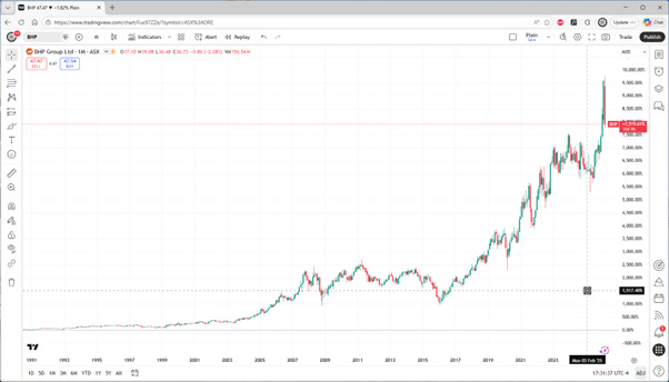
Of course, the comparison of two stocks as investments requires a common period, but the data for this vendor starts on the same date.
The cumulative total return of BHP over that period was 7,919.61%.
Notice that the total return is near identical.
Switching back to price only, we find 1,484.46% for BHP, which is considerably less than that for RIO. The difference is the higher historical yield on BHP.
Now comes the cute trick…
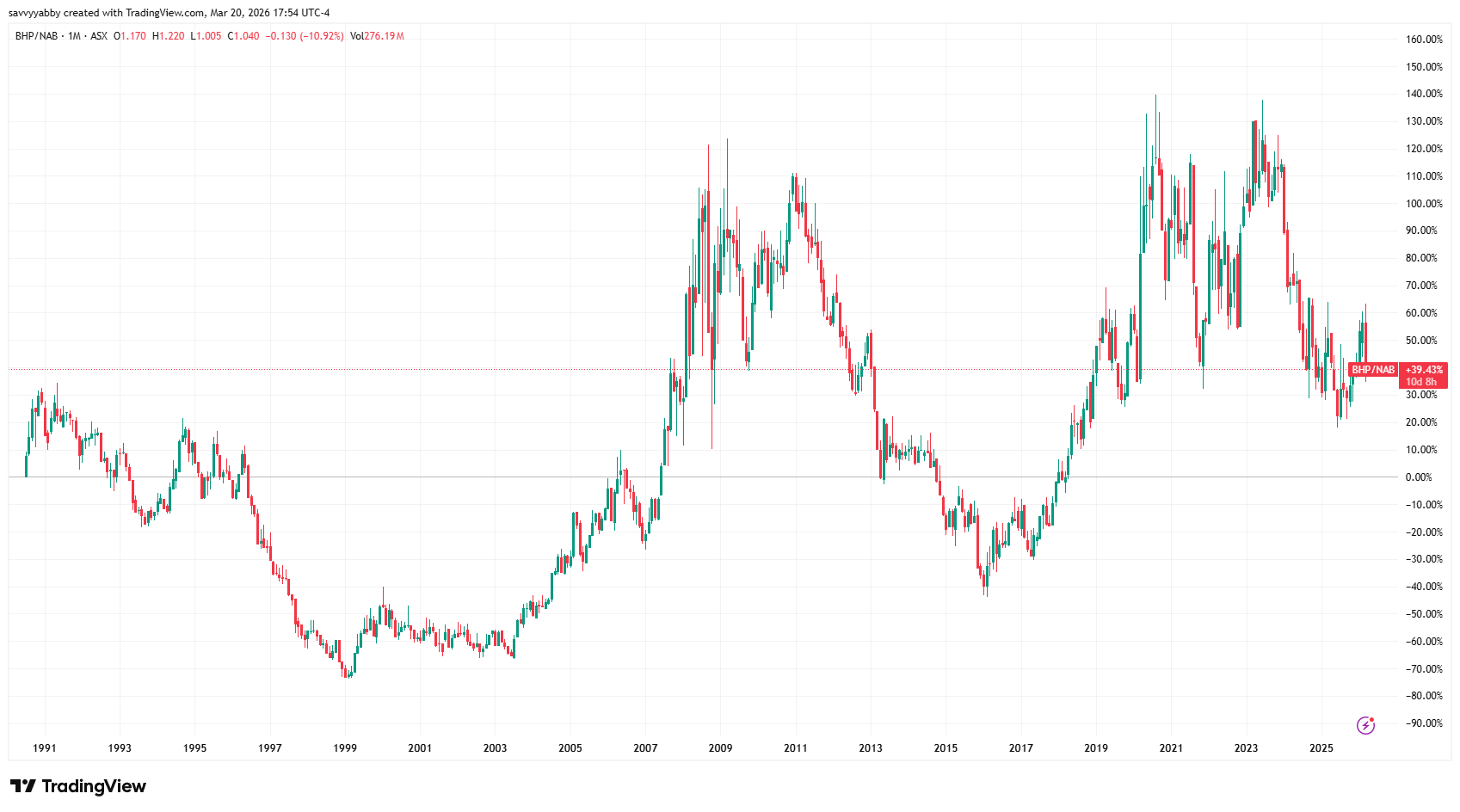
The feature that professional traders look for is the relative value chart. I have shown how to this in my charting tool using a formula: ASX:BHP/ASX:RIO. The result will be a comparison of the relative total return between both stocks over time.
Notice that there has been virtually no difference in the final result over that period of thirty-five years. Currently, you were down -10.10% holding BHP vs. RIO.
What I want you to notice is that there have been large relative swings, especially the one in the Global Financial Crisis (GFC), where RIO had a stretched balance sheet and needed to do an emergency capital raising. Counterintuitively, this was a great time for investors to sell BHP and buy RIO. We know that with hindsight.
This is financial relativity: there are opportunities trading between stocks.
What I have shown here is a standard method used by hedge fund traders to help them make decisions on what to sell in exchange for what to buy.
In this substack, our portfolios are fully invested, so all changes are of this kind. You will hear me talk of the cash decision, but mostly I try to avoid it. Some conditions benefit from direct cash holdings, but usually when you cannot find a hedge.
To cement this idea let us look at ASX:BHP/ASX:NAB. The NAB chart alone over that period since 1991 shows a total return of 5,651.89%, versus BHP at 7,919.61%. You expect that BHP should beat NAB in the relative value chart.
How about that?
They are nearly the same: the difference over 35 years was 39.43%.
If you annualize this result you get about 0.95% in favour of BHP.
There are a couple of lessons here, so let us take stock.
There are big relative swings between stocks, which can be spotted easily using a ratio chart, and adjusted for dividends, to get a full total return comparison.
There are also big relative swings between industries, which can be hard to track if we do not take out the market cycle effects of changes in sentiment.
The timing of a shift between two stocks in a common industry, or two stocks across two different industries need not coincide with market tops or bottoms.
This is the main market insight that I want to share at this time.
Professional traders look at ratio charts to help them decide on when to trade. The pure risk asset versus cash decision is fraught because all correlations tend towards one in a market panic. There is no signal there, just noise.
The Market Schwerpunkt Revisited
Once you have grasped the concept of financial relativity, your investment world expands to readily encompass all asset classes. When measured in a single basis currency, two assets expressed in a ratio chart have a relative return.
This may be surprising, but the relative chart is the same in any currency.
Provided that you quote both assets in the same currency, the ratio is not changed when you alter the measurement currency.
This is a subtle but key point.
What investors care about is growing their asset purchasing power.
The illusion of cash is that it has a fixed purchasing power. This is only so when considered in isolation. The purchasing power of cash for assets is variable.
Once we use ratio charts and adjust these for the income that any asset may generate, the true changes in relative purchasing power become clear.
To illustrate, let us compare the total returns on a developed market mining country MSCI Australia AMEX: EWA with a developing one, MSCI South Africa AMEX: EZA.
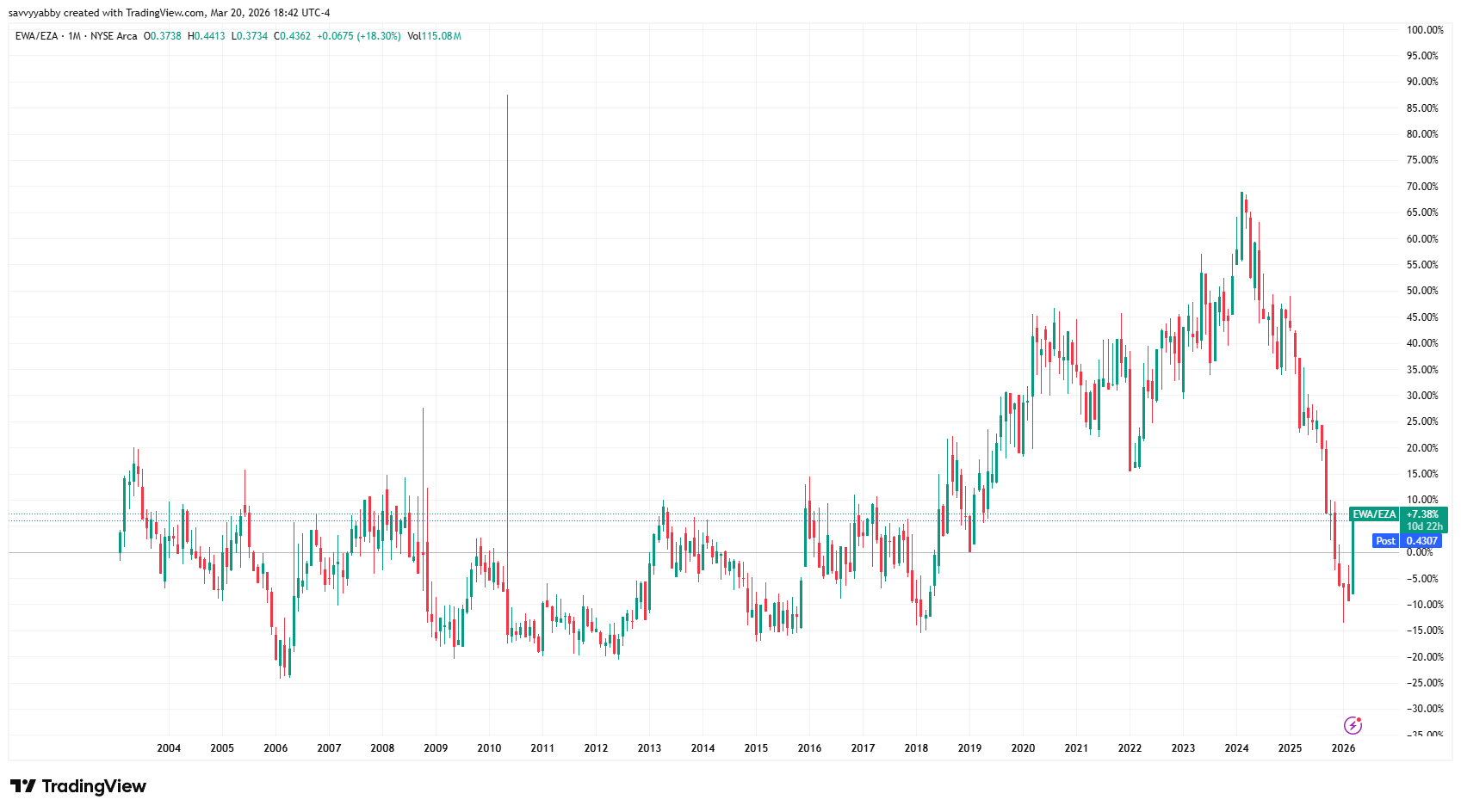
These MSCI indices are large company biased and traded in USD in the USA. The South African Rand (ZAR) has underperformed the Australia Dollar (AUD).
This is not an artificial comparison. You could have bought both ETFs in New York, using US Dollars (USD) to buy them, reinvested the USD dividends from each, and wound up ahead buying South Africa over Australia.
Unfortunately, this sort of crazy comparison is likely to become the norm. When there is substantial government intervention in interest rates and exchange rates finding a true comparison of investment return is difficult. Relative return charts fix that.
Note that the recent period of marked underperformance of MSCI Australia versus MSCI South Africa has reversed this year. While Australia and South Africa are each major mining markets, the core commodities are different. Australia has iron ore as the key export commodity, while South Africa has gold and platinum.
Let us turn this into a more topical question: US equity vs. non-US equity.
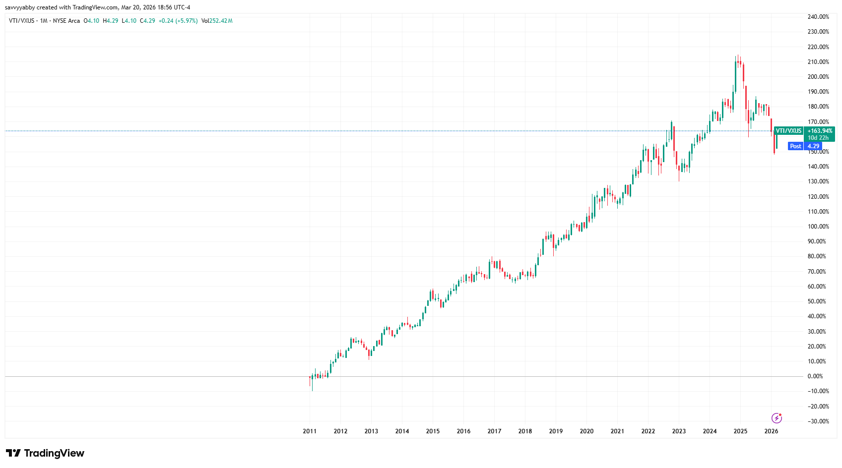
The Vanguard ETF series as two convenient members for comparing the total returns on US stocks versus non-US stocks, with currency removed. Above I have plotted the total return chart for the Vanguard Total Market Index AMEX: VTI, versus the non-US Vanguard Total Market ex-USA Index XNAS: VXUS. Over the period since 2011, US stocks have won hands down. the five-year picture is less convincing.
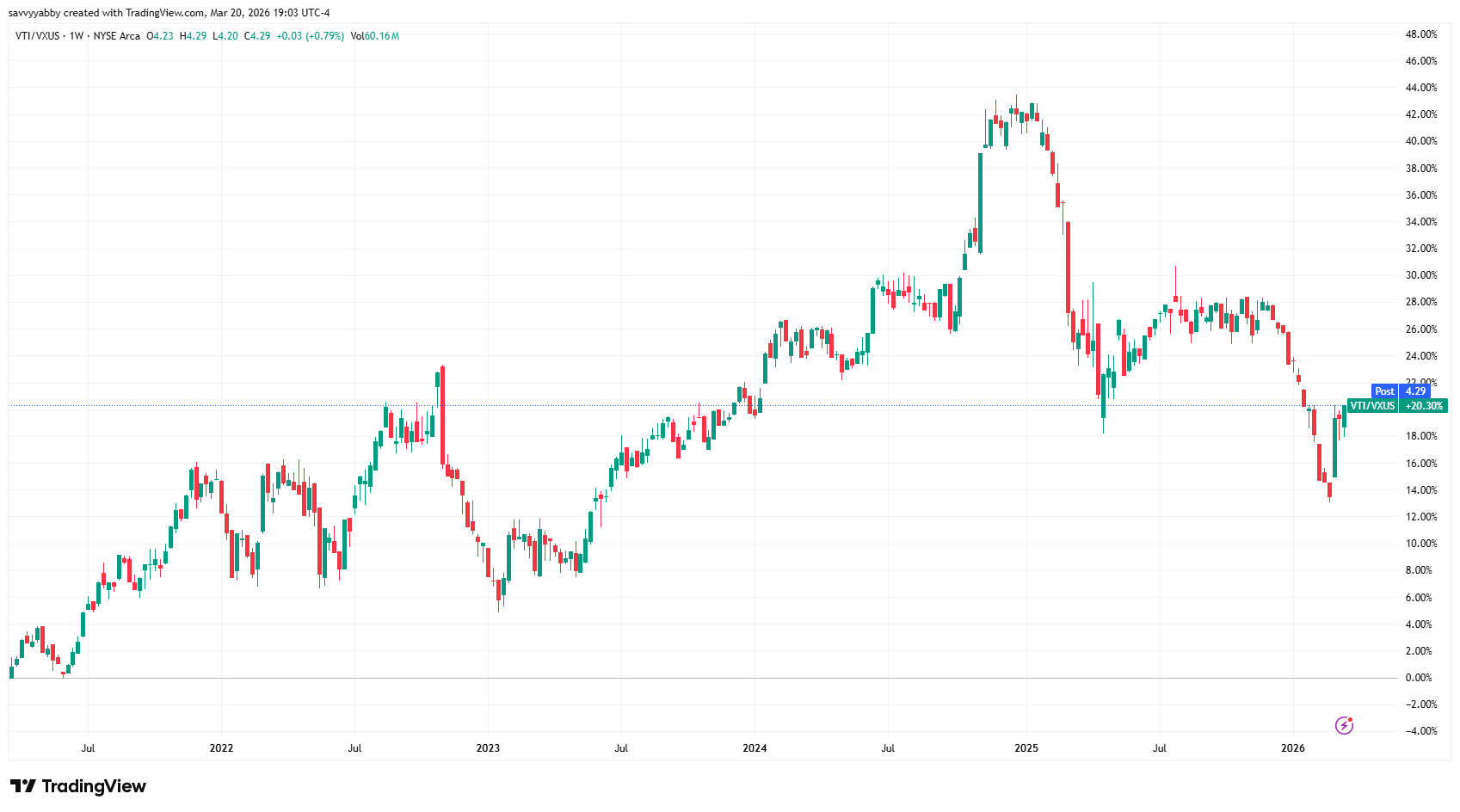
There are always swings and roundabouts in global markets, but you can appreciate that it is worth paying attention to long-term trends in relative total return.
In The Market Schwerpunkt (Gold vs. Bonds), written on 5-Feb-26 before the Gulf War began, I noted the long-term trend of relative total return between gold and bonds.
The Gulf War began on Friday 27-Feb-26. There has been a modest reversal, with bonds gaining relative to gold to recover the value on Friday 16-Jan-26.
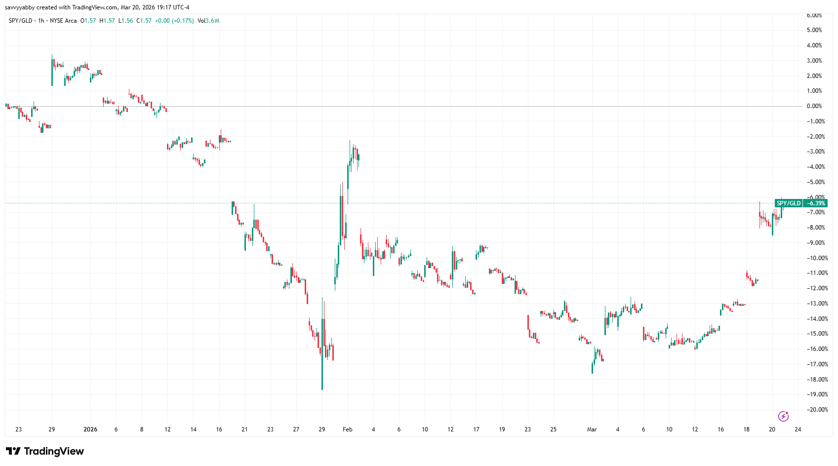
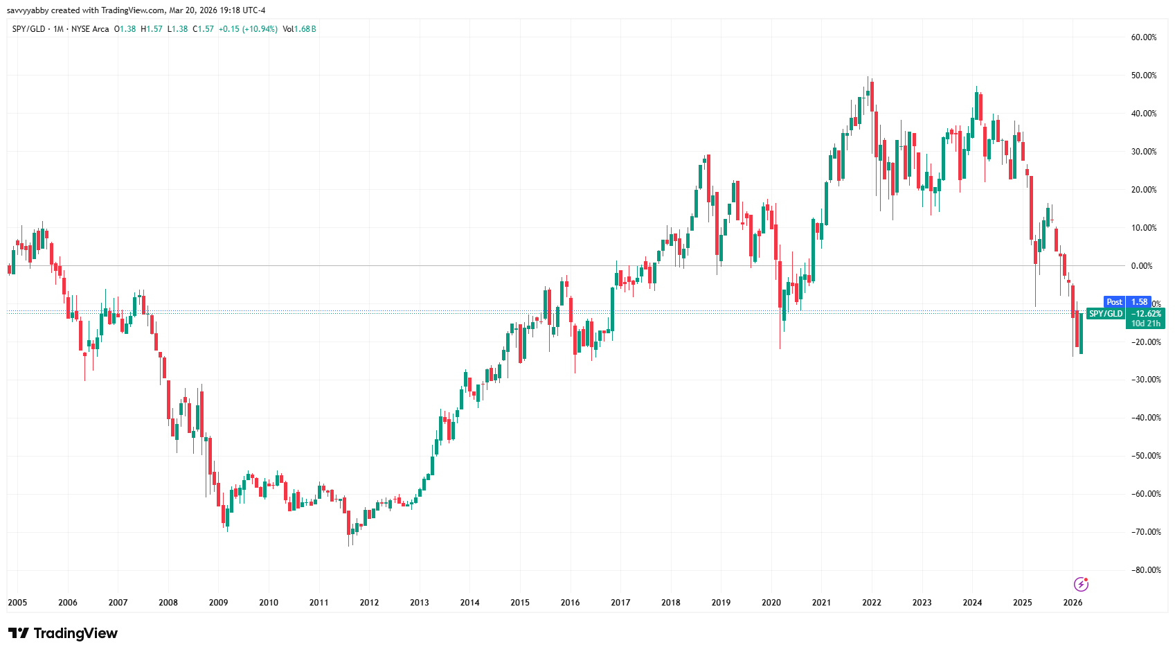
Let us look at the S&P 500 AMEX: SPY vs Gold AMEX: GLD five-year chart.
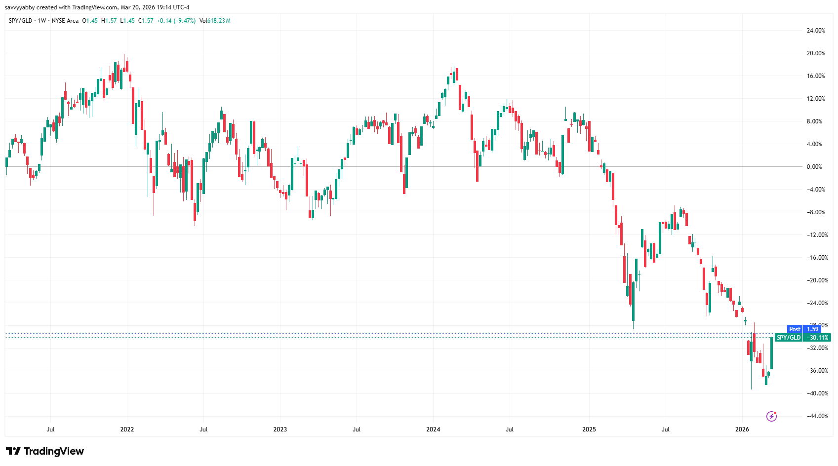
The three-month picture for the S&P 500 versus gold is showing a recent uptick.
If we look back to encompass the GFC period we can see that the present recovery is delicately poised. We are at about the halfway point, and unclear on direction.
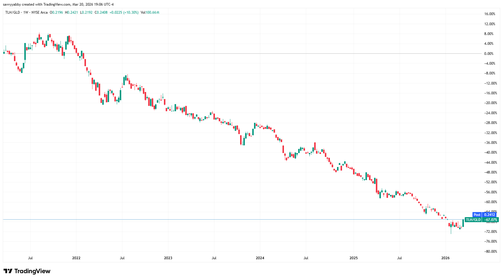
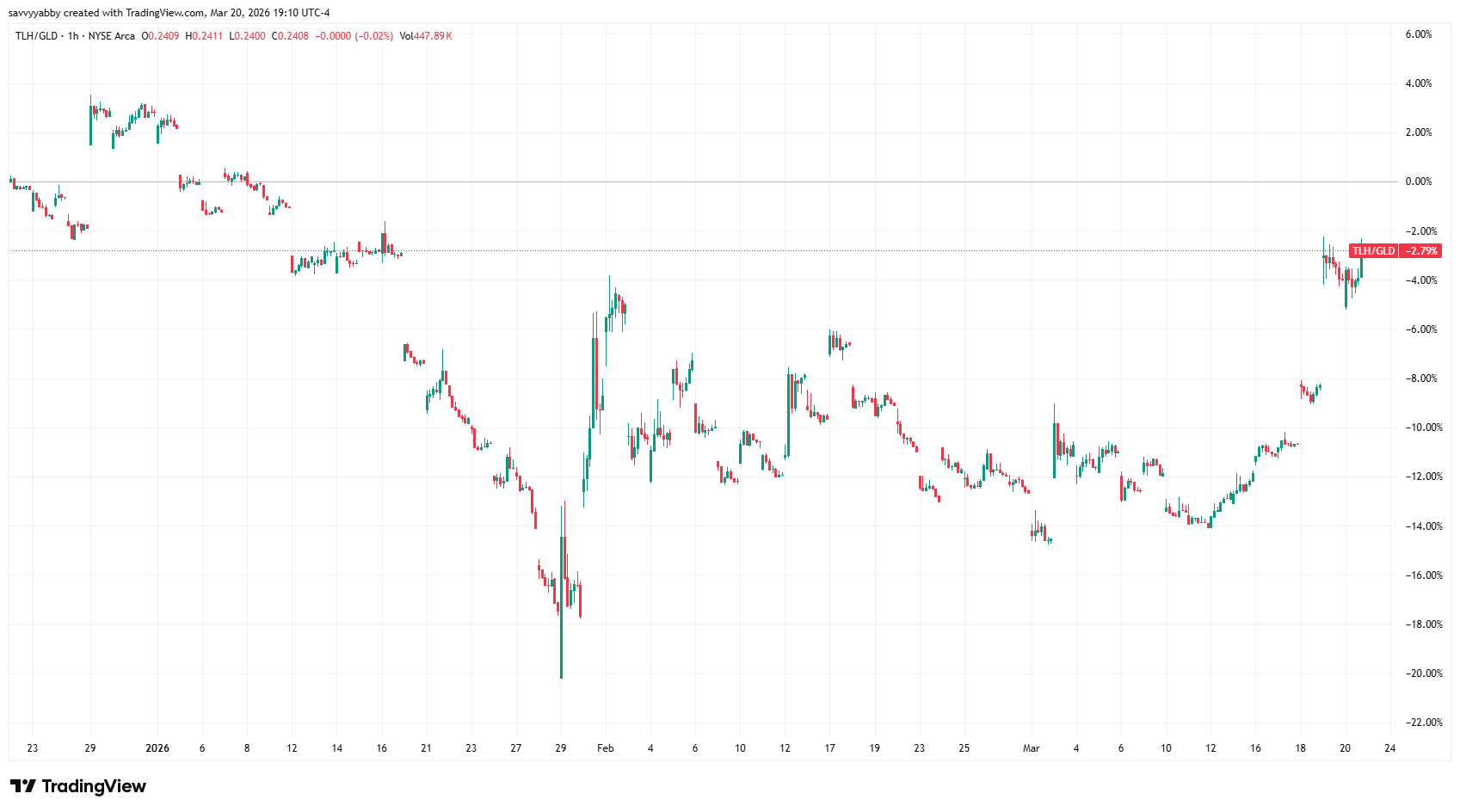
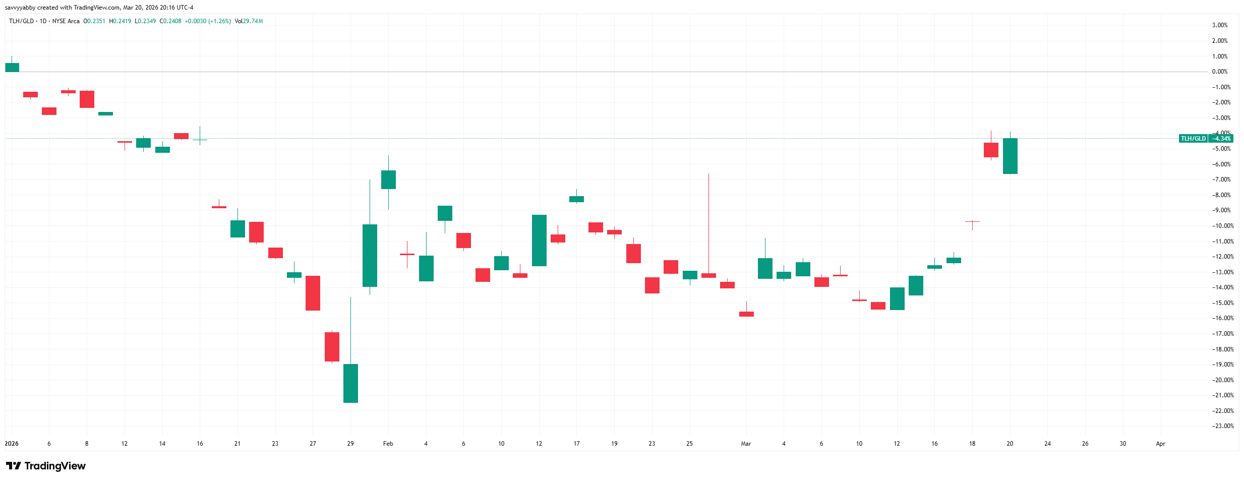
To check stocks versus bonds, we can look at the S&P 500 versus the TLH.
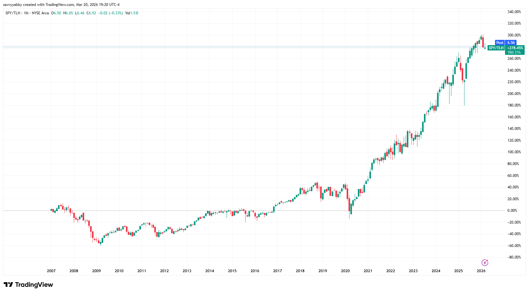
None of these analyses are conclusive, but there is one message I take away. US stocks have done great versus everything else, until about two years ago.
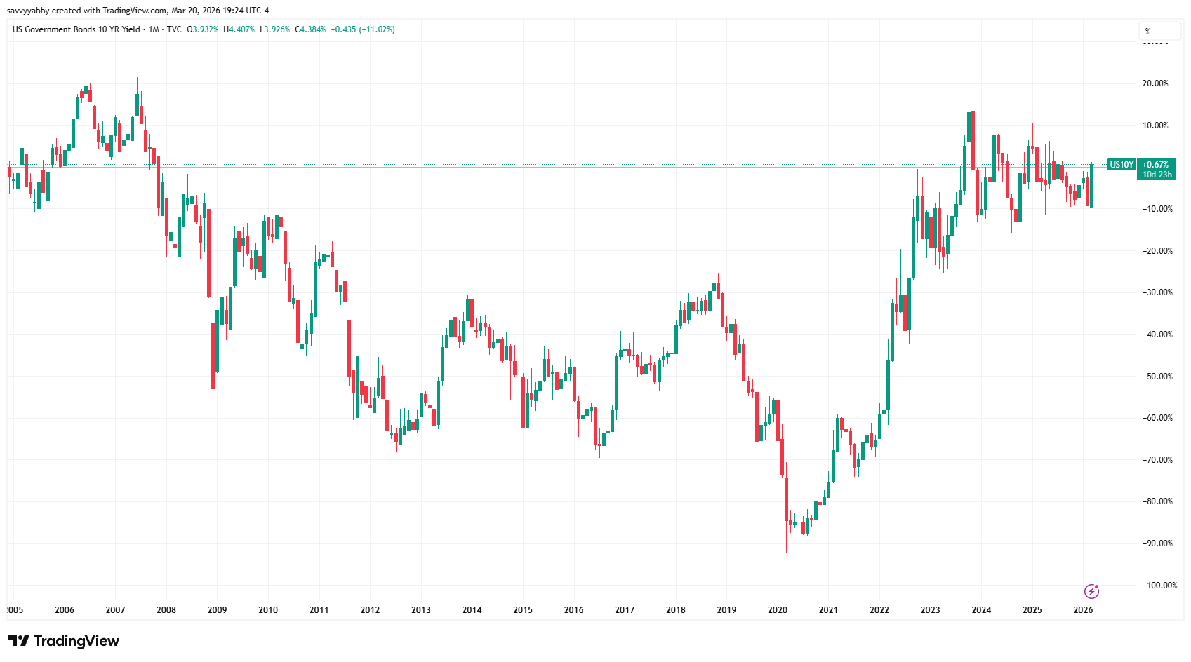
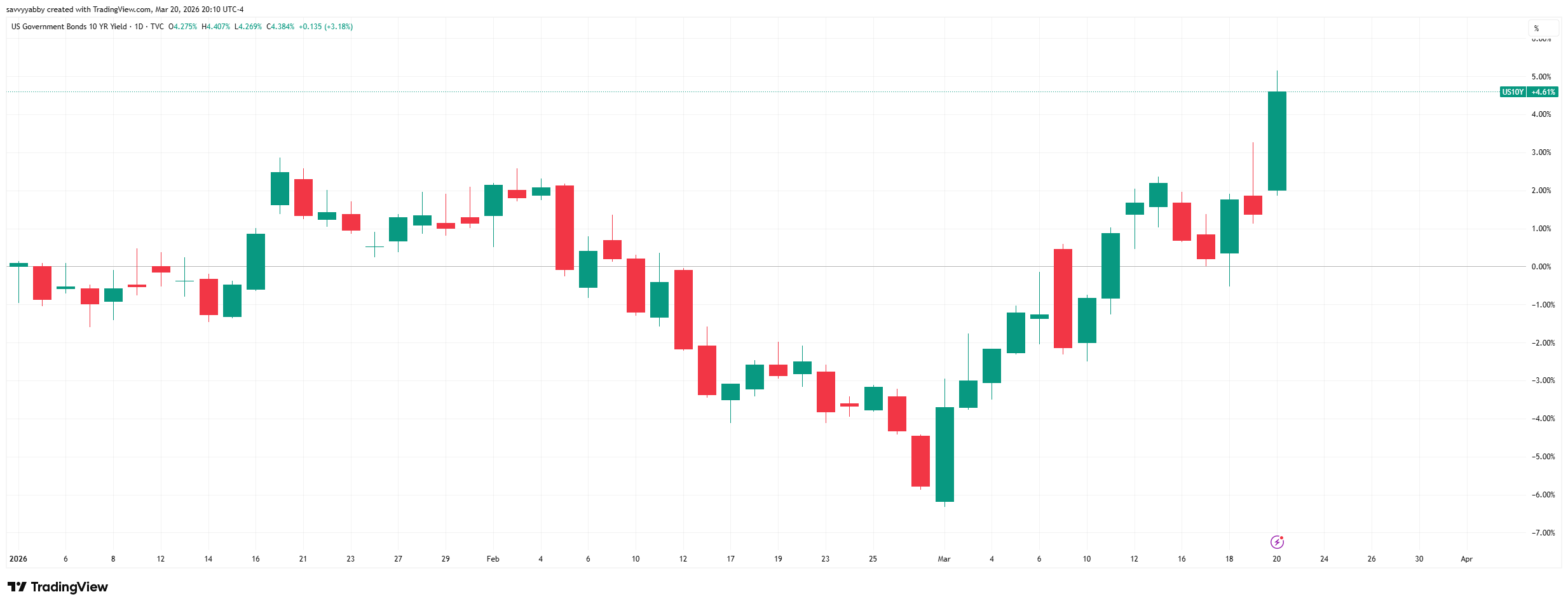
US bonds have been doing badly, in relative terms, for most of the past five years. In the last trading session, US ten year note yields rose to the highest since Sep-2025.
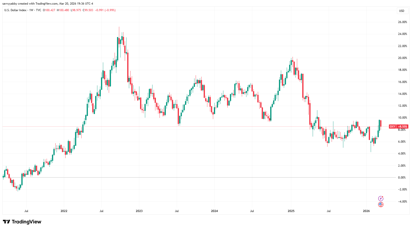
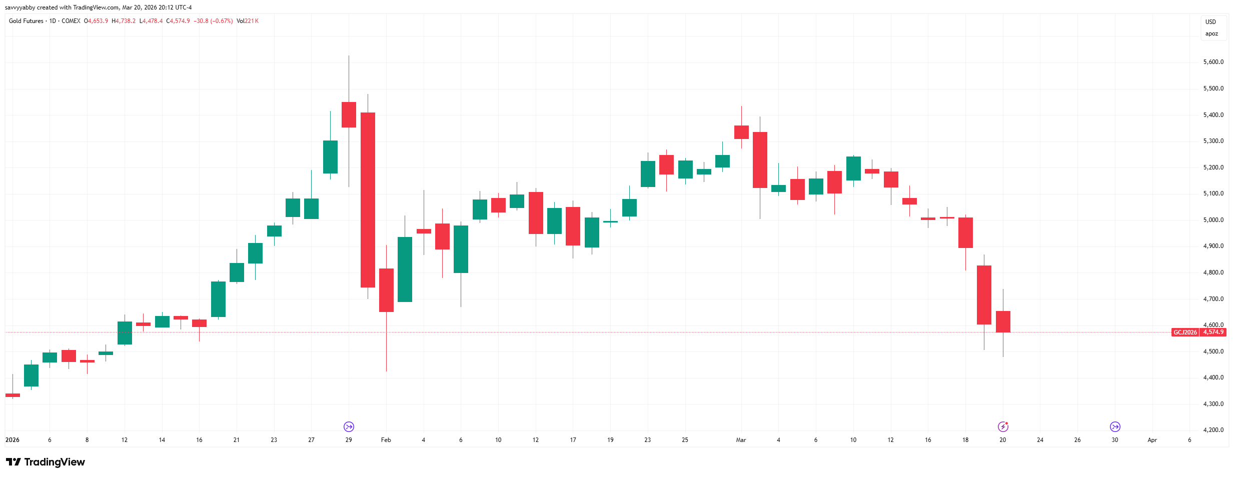
In the last month, we have seen major volatility in precious metals, which fell and the dollar index, which rose, although it has since fallen back some.
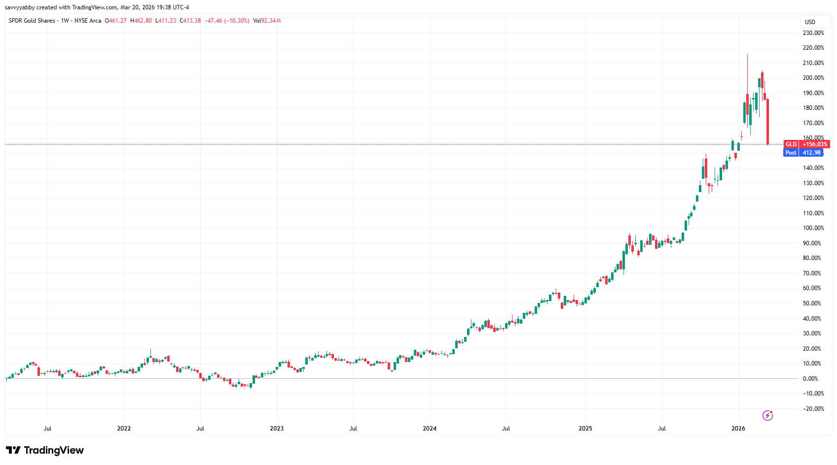
Gold has corrected to the start-of-year levels.
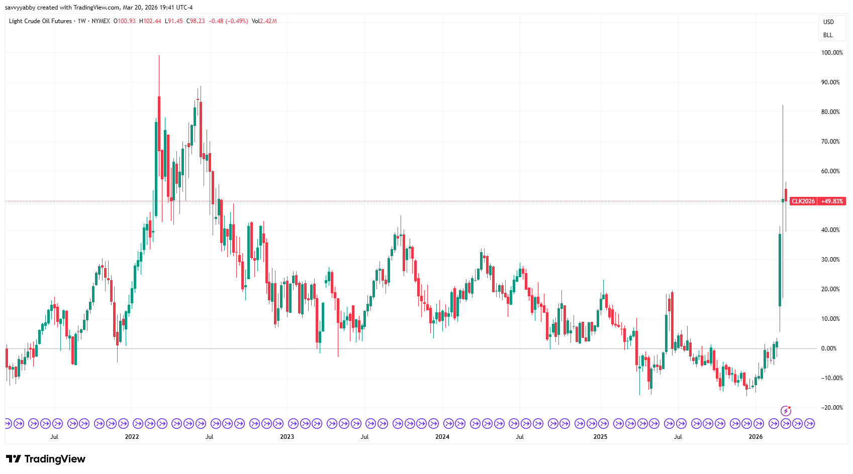
West Texas Intermediate (WTI) is back pushing to 2022 levels.
In our Market Schwerpunkt piece from 5-Feb-2026, we nominated gold versus bonds as the key ratio to track. This view has not changed, and we have a war now.
There are clear and present danger of a repricing of all risk assets.
War narratives are likely to push to the fore, with the USD regarded as a safe-haven currency, but we are cautious on that view. There is looming stagflation risk due to supply shocks in energy, fertilizer, and basic chemicals, like sulfur, from the Gulf.
Upwards of 20% of oil and natural gas come from the Guld region, and even higher levels of nitrogen fertilizer, as urea, of 30% and 50% for crude oil derived sulfur.
There is an acute risk of war-induced stagflationary slump.
Cash looks like the easy decision, but I would caution against that choice.
There is enormous relative volatility in asset prices.
Just a few days of trading are skewing key relatives wildly.
What we can do is baby step towards better portfolio allocations, taking weights up in some areas and down in others. This is a dynamic process, and relative value is key.
Conclusion
The purpose of this note was to lay out clearly the reasoning and methods behind the use of relative value total return charts to compare across asset classes.
This is an important technique to have in your toolbox for times like now when the news is full of both information and disinformation, and it is hard to tell which is which. The bottom line is that we are headed for a global supply shock.
This global supply shock was initiated by a war of choice in the Gulf.
Unlike the 1973 Yom Kippur War related OPEC oil-embargo, this supply shock can be directly traced to a decision by Israel and the USA to make a surprise attack on Iran.
Whatever the merits of regime change in Iran the global supply shock that is coming is due to the political decisions of the USA and Israel.
This alters the geopolitical circumstances considerably.
The USA is traditionally a safe-haven market that attracts global fund flows during a time of crisis. It has also been home to a well-performing stock market.
The challenge at this time is that US finances are stretched, and there are likely many new bonds to be issued to fund this war. Apparently, the Trump Administration now seeks another $200B USD of funding to the Pentagon for this war. That is 20% more than the current annual budget, with a 50% increase over that sought in 2026.
This does not augur well for the trajectory of US bond yields.
The year-to-date performance of US yields is up, with a big move in the last session.
We must also note the severe reach down in gold futures.
There is no hidden mystery here, both gold and bonds are falling relative to cash.
In the short-term, cash is undoubtedly king when all normal hedges fail.
However, note that the purchasing power of gold for bonds is largely intact.
Note that a sudden break upwards in US yields is now possible. War financing can be expensive in terms of the risk premium demanded by investors. The USA is financing itself and Israel and will likely need to subsidize higher gasoline prices through tax cuts, handouts, or other political inducements to US voters.
What will turn this market is a clear answer to this one vote of confidence:
Is the USA still a financial safe haven in a global geopolitical storm?
In all honesty, it matters little what I think the answer should be. The entire purpose of this form of analysis is to accurately track investor voting in real time.
In the early stages of this Market Schwerpunkt battle, twixt US Bonds and Gold, we have seen a few recent tactical wins for US Bonds. The trouble is that there is clear support for dedollarization outside of the West.
Will China now sell US Treasuries and put a floor under gold?
This is a vexed question as the US has a lot of war issuance to do.
Why would China willingly fund this war of choice in the Middle East?
Conversely, will we see BRICS nations selling some gold to purchase oil.
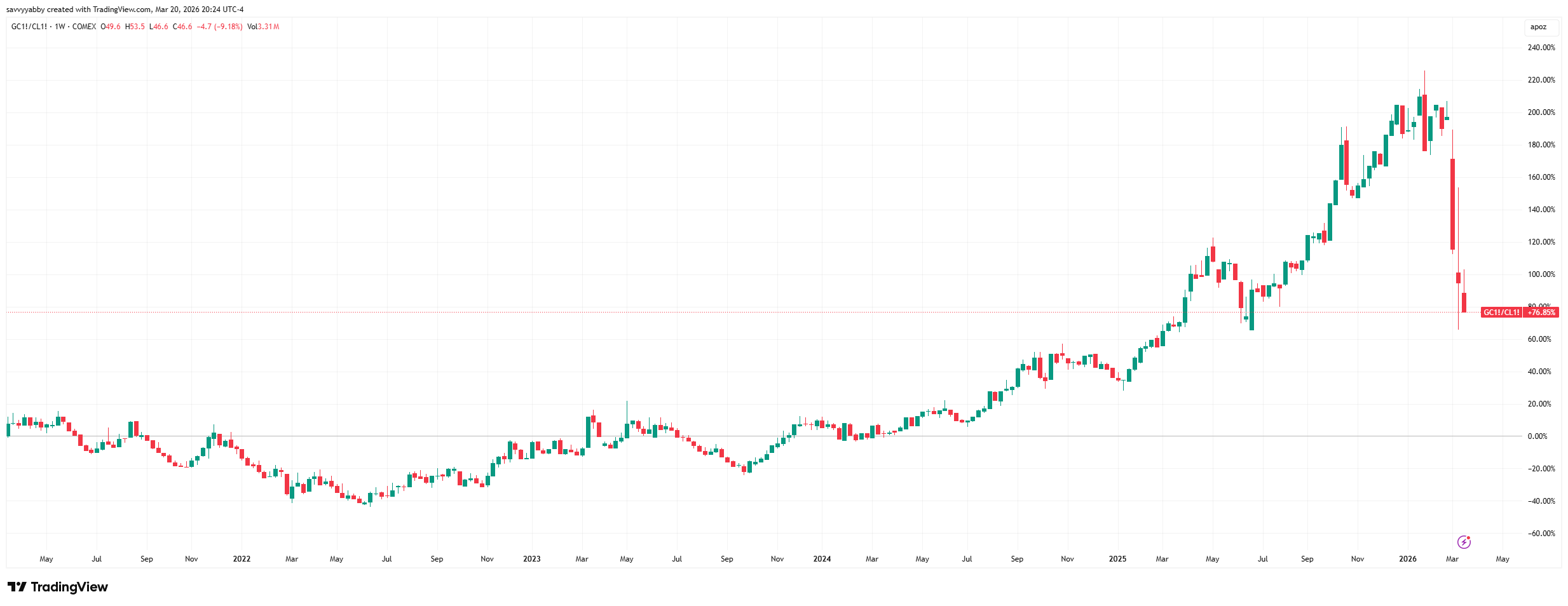
The relative value of gold, when used to buy oil, increased over 200% over the last five years, but has fallen a huge amount, due to the spike in oil prices.
This ratio directly impacts the valuation of gold miners, due to the high use of diesel fuel in gold mining as a component of the cost of production. This fact promotes the relative spread of the VanEck Global Gold Miners AMEX: GDX to GLD ratio.
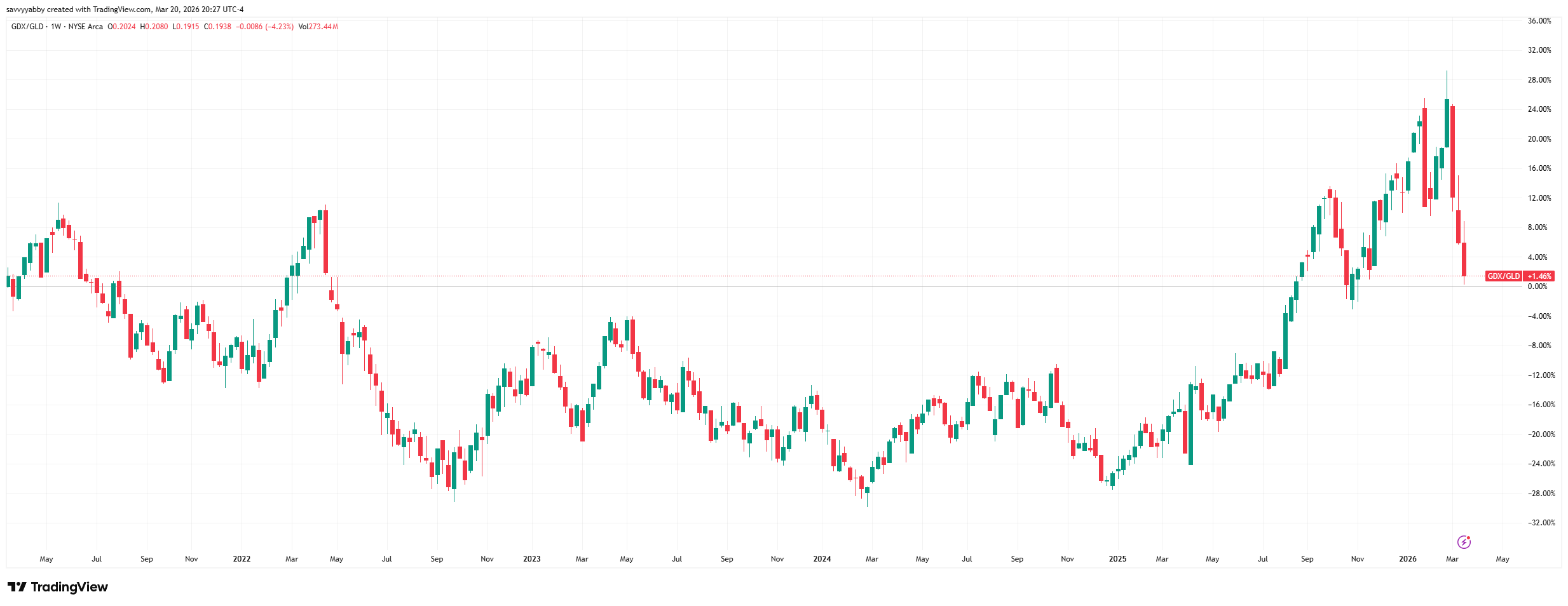
From one point of view, the dash for cash across precious metals and miners of them looks like the smart bet. However, crude oil cannot stay high without causing a very serious global recession. Coming out of that, gold has high purchasing power for miners of gold. The financial relativity of this comparison matters.
In conclusion, there is a serious prospect we are entering a new financial regime with supply shocks and accelerated government demands for war financing, and the social offsets to a higher cost of living, starting to eat into investment returns.
There are risks that the US safe-haven status of prior cycles morphs into something else due to the nexus between US dollar issuance and war financing.
It is hard to see who benefits from this war apart from those selling weapons.
Even the arms manufacturers are likely to run into supply challenges due to shocks to shipping and counter actions from key suppliers, like China, through sanctions.
The only recent guides we have are the COVID supply shock, which led to enormous monetary stimulus, followed by inflation, and the Russian experience at the start of the Ukraine war, followed by currency weakness and domestic inflation.
The one thing the USA and Russia have in common is that they are net fossil fuel energy exporters. The assumption is that the USA will be fine and avert domestic inflation and budget problems. This was not true of Russia in 2022.
In conclusion, we think it is advisable to allow cash from dividends and income to accumulate in your portfolio. I would not commit new cash to this market.
In the global context, I would closely follow key asset spreads:
Gold versus Bonds: GLD vs. TLH
Gold versus Stocks: GLD vs. SPY
Gold versus Oil: GC versus CL
Notice that I have gold as the anchor of each of those three spreads.
Of course, I look at others and would urge you to do so also.
The reason I have gold as the anchor is that it forms a major allocation of my own portfolio and is therefore a funding source for any value that emerges.
At this time, nothing looks screamingly cheap versus gold, even though gold is back to where it was at the start of 2026. If I am to reallocate, I want clear value in what I am switching into. Investor leverage in precious metals, via futures markets, is likely the cause of the recent violent correction. However, other larger asset markets, in stocks and bonds, have yet to see any significant move towards cash.
That looks to be starting now, which is why I mention those three spreads.
This note also serves to highlight how I am thinking about locating value, and the decision to trade withing our model portfolios. These are fully invested. Cash is no option within those strategies, so we must look at stock vs. stock relatives.
To give you a taste of that, look at NAB XASX: NAB vs Stockland XASX: SGP.
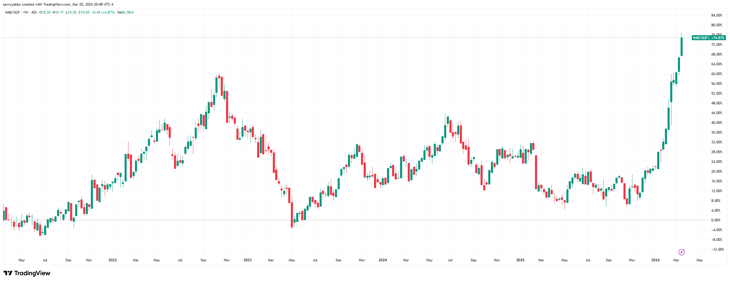
There can be many reasons for a rapid change in one stock versus another, but the narrative can easily overshoot. Banks now look expensive versus REITs.
I will take this up in future notes.
Good luck with your investing!
Great piece. Is a book coming??!!
A couple of questions:
1)Which intervals are you using in tradingview when checking relative value charts? day?week?month? does it matter?
2)You mention: There are also big relative swings between industries, which can be hard to track if we do not take out the market cycle effects of changes in sentiment. Do we take out these effects simply by using the relative value ratio?